
Pull-up banners, brochures, product catalogues, magazine spreads and press ads. I've been doing this since 2005, across motorcycles, boats, hi-fi, golf carts, hotels and health magazines.
Banners & display · Brochures & catalogues · Magazine and editorial · Press ads · Print-ready artwork
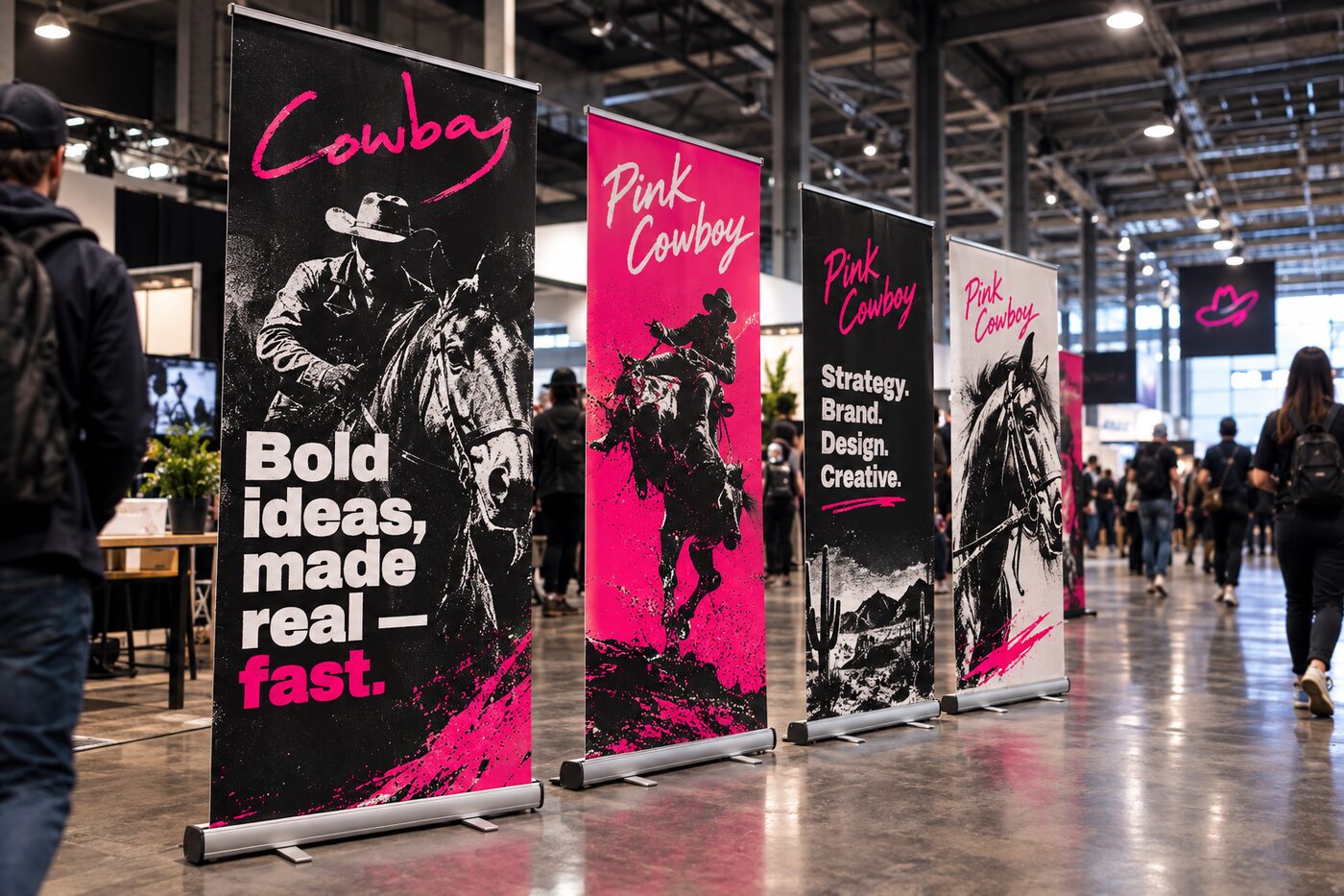
Most of it is the stuff a product range actually needs, rather than the stuff that wins awards.
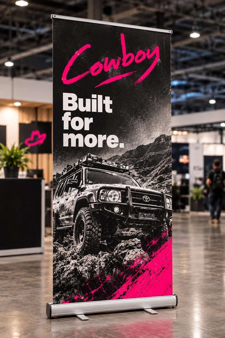
The workhorse. Dealer floors, trade shows, launches, reception areas. Designed to be read while somebody walks past, not while they stand and study it.
Ranges, variants, spec tables, price lists. Long documents that have to stay readable when a product line changes halfway through the year.
Covers, contents, features, advertorial. Working to a grid and to a deadline that doesn't move.
Single pages that have one job. Sized and supplied to whatever the publication's spec sheet says.
Files the printer opens without phoning you. Bleed, crops, CMYK, fonts sorted out, resolution correct at the size it's actually printing.
I spent three years at Yamaha South Africa working across departments. Motorcycles, marine, audio-visual and golf carts, plus the aftermarket brands underneath them. Different showrooms, different buyers, same company on the badge.
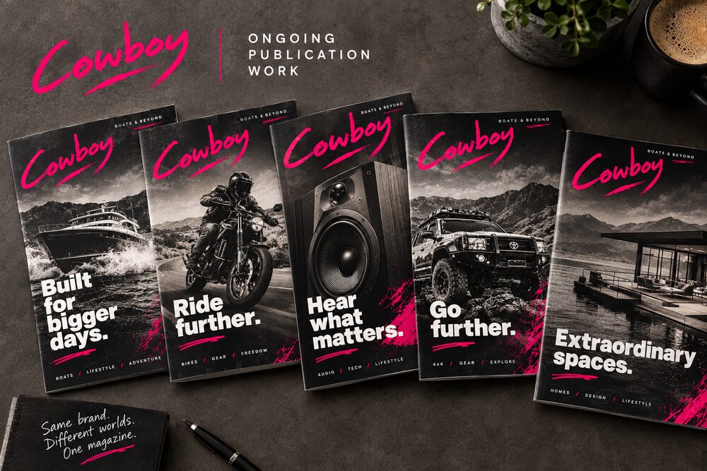
That's harder than it sounds. A banner for a jet ski and a banner for a set of speakers can't look like they came from two different firms. They also can't be the same layout with the picture swapped, because a bloke buying a boat and a bloke buying a hi-fi are not standing in the same room or reading at the same speed.
So you build a system. Same grid, same type sizes, same place for the logo and the legal line. Then you let the photography and the colour do the work of telling them apart. Once that's set up, the next department's banner takes an afternoon instead of a week.
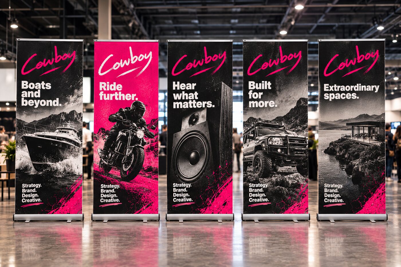
People design these at A4 on a screen and then wonder why nobody reads them.
None of that is clever. It's just knowing what the thing is for before you open the file.
Before the product work I came up through publishing. Magazine and repro design at Advert Square in Potchefstroom from 2005, then in-house design for upscale magazine publishing at Camelot Health in Johannesburg.
Editorial teaches you two things that carry into everything else. A grid you can hand to somebody else and have it still look right. And finishing, because the printer's deadline is a real date and nobody cares how you felt about the cover.
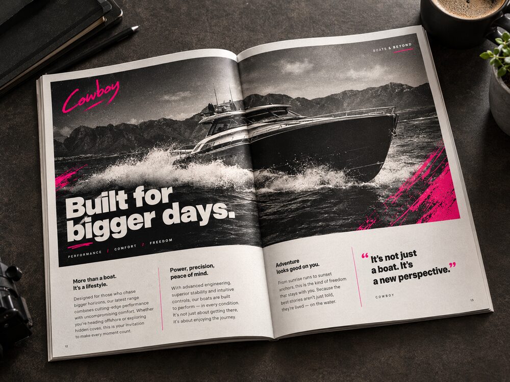
A good chunk of what you're paying for on a print job is the part nobody sees. Bleed where it needs bleed. Crop marks. CMYK, not RGB with a hopeful attitude. Fonts outlined or supplied. Images at the right resolution for the size they're going to.
I came up through repro, so I've been on the other end of the phone call. A file that has to go back and forth twice costs you days, and days are usually the thing you don't have.
You get the artwork, not just the PDF. Print-ready files and the working files, so the next person who needs to change a price isn't starting from scratch.
Print was the first half of my career. The UX work came later and sits on top of it.
Magazine, repro and web design in Potchefstroom, across a range of brands.
In-house designer in Johannesburg, publishing work for upscale magazines, plus Camelot and Thalgo campaigns. Freelanced alongside it for a photographer and a conferencing company.
Web and print across hotels, real estate and facility management, reporting to the CEO and working alongside the sales team.
Designer and developer across motorcycles, marine, audio-visual and golf carts. Websites, print advertising and banners for every department, plus the aftermarket brands.
Front-end, then UX and product design for banks and insurers. The print habits came with me: work to a grid, finish the file, hit the date.
Tell me what it is, how many pieces, and when you need it on the floor. I'll come back with a price and a timeline.