
I'm Wouter Kirstein. Twenty five years designing products, and building a good number of them too — for South Africa's banks and insurers, and for people starting with nothing but an idea. Here's a selection, with the thinking behind it.
Product design, interaction design and front-end · Web · Built 2026
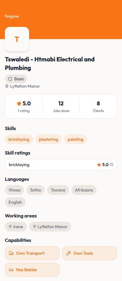
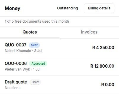
Ting Me is a South African trades marketplace. Plumbers, electricians and painters — Jobbers, in the app — send quotes to clients through it.
Every quote was typed from scratch on a phone. Description, quantity, price, one row at a time. No templates, no saved items, no way to reuse last week's. And most Jobbers quote the same handful of jobs every week.
The job was to read the chat between the Jobber and the client and fill the quote in for them. That part is easy. The work was in deciding what happens when it gets it wrong.
Read a chat about a leaking geyser and you can describe the work with reasonable confidence. You cannot guess what this Jobber charges. Nothing in the app stores a price list, and a Centurion electrician's callout fee is not a Lichtenburg painter's callout fee.
So a single line of a quote holds two very different levels of certainty, sitting right next to each other. The description is probably right. The price is a guess. Nearly every decision after that came from this one fact.
The usual answer is a confidence score on each line. 87%, or high, medium, low. I didn't do that. A model's opinion of its own accuracy isn't worth much, and putting a number on it mostly tells the Jobber which lines they can skip reading. That's the last thing you want on a page with their bank details at the bottom.
So instead of saying how sure it is, the quote says where the words came from:
An empty box costs four seconds to fill. A confident wrong price can cost R400. That's the whole argument.
You said R450 in chat
Subtotal: R 830.00
If a line is right, the Jobber does nothing. It's already in the quote. If it's wrong they type over it, and the line stops looking suggested as they do. If it's useless there's the delete button that was always there. One link clears all the suggested lines at once, with an Undo in the message that follows.
I left out Accept and Reject buttons on each line. They make people click to agree with something they already agree with. Agreeing should be free. Only disagreeing should cost anything.
An empty quote screen is always an acceptable outcome. It's what Jobbers had before this, and it works fine.
I kept a running log of decisions while building this, including the ones I got wrong.
The first was in the code that strips personal details out of a chat before anything is sent. It was written to catch phone numbers. Given a bank account number like 62012345678, it found the 0 in the middle, started from there, and left the first two digits sitting in plain view. Output that looks redacted is worse than output that obviously isn't, because nobody looks twice. I found it by running the cases before writing the test. The test I'd written first agreed with the bug.
The second was in the reporting. I wanted to know how often Jobbers kept a suggested price. The count read the wrong field and missed every line they'd left untouched, which is exactly the case where it had worked. It would have come back as zero. Zero reads as "Jobbers reject every price we suggest", which happens to support the design I'd already picked. A measurement that can only agree with you is the dangerous kind.
Almost every decision here came from refusing to blend two different kinds of doubt into one number. Once you accept that it knows the job and doesn't know the price, the rest follows on its own.
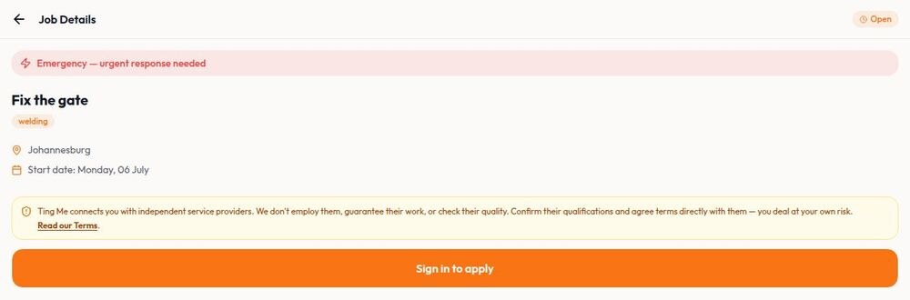
A client posts a job, a Jobber applies, they talk in the app, and the quote goes out from that conversation.
Product design and build · Working prototype, not yet in front of real users · 2026
Hitch helps people going the same way find each other and travel together.
It started as a car-sharing app. While building it I changed that. You can now offer or ask for part of a journey whether you're going by car, bus, Uber, train, or a mix of all of them. That wasn't a wording change. It went into the database, the search and the language.
The old setup assumed a vehicle. How many people could come along was stored inside the car's record, so a bus trip had to pretend to be a car to exist at all.
Now the type of transport belongs to the journey. So does the number of places. Each stop knows how many people are travelling through that part of the route. Cars still have car details. They're just no longer compulsory.
Matching on start and end points is the easy version, and it's the wrong one. Someone joining halfway shouldn't use up a place on the parts of the trip they're not on. And a journey that passes close to you counts, even if it doesn't start where you are.
So the route is stored as a real line on a map. The server works it out once and keeps it, then checks that your pickup comes before your drop-off along that line, and counts places only on the stretch you actually travel.
All of that stays on the server. The app stays quick, the same route isn't paid for twice, and there's one version of the truth instead of a copy on every phone.
"Could you come fetch me?" is where lift-sharing usually gets uncomfortable. In Hitch you ask through the app. It works out the extra distance and time, checks it against limits the driver set for that trip, and the driver says yes or no. If they say yes the route updates and anyone whose timing has shifted gets told. Nobody has to be the one who says no in a chat window.
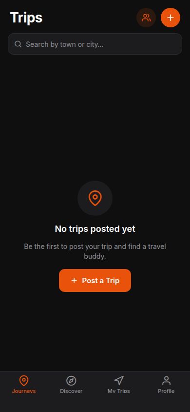
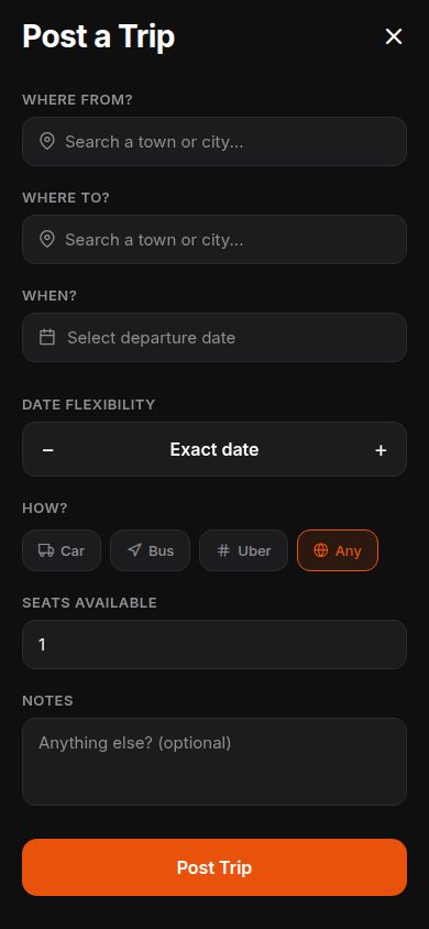
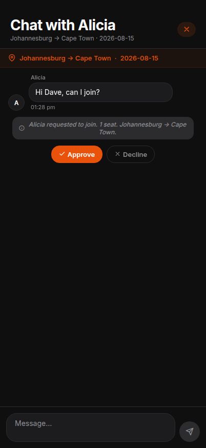
An Expo and React Native app, an Express and PostgreSQL server, and Google Routes for the maps. Journeys, search, requests to join, conversations with a record of what was agreed, approvals, notifications, ratings, profiles and detours all work end to end.
It's a prototype with a demo login, not a live product. But the parts you'd need before putting it in front of real people are the parts that are done.
Most of my last decade. Research, design, and often the front-end too.
Absa wanted insurance that behaved like an app instead of a phone call and a stack of forms. I worked on research and design across motor, building, contents and all-risk cover. The clip is the claims prototype: report it from your phone, watch it move, get paid.
Rethinking how customers see their accounts and move between them. The clip shows the redesigned account list. We tested prototypes before anything got built. I've been on and off this programme since 2018.
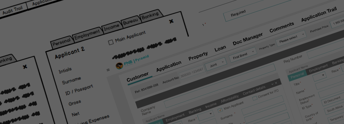
Design and front-end on the internal systems the home loans team uses all day. Drupal, WordPress, Adobe XD and Balsamiq, working in sprints with everyone in the room. This clip is from the first one.
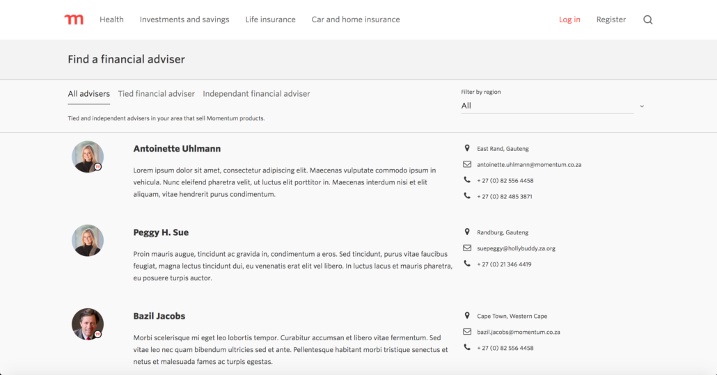
Interface design and front-end, including the find-an-adviser page above. Angular, SASS and HTML5. I designed it and then built it, which saved a lot of arguing about what was possible.
Sprints on what was sold as South Africa's easiest investment app. We found an expired-card problem that was quietly stopping people from putting money in, and fixed the order of a few steps so it couldn't happen. Fewer support calls, better app store ratings, and money moving again.
A calculator for the production line of the new electric Mini in China. Complicated sums turned into something a planner could actually use. Through CyberPro and Isanqa, 2021.
Liberty's service console, welcome pack and Salesforce journeys. At Deloitte, the Gratitude App, Toursure and Customer One in Salesforce. Research and design at the scale where a small change affects a lot of people.
A team had been going round in circles for months. We ran a rough Balsamiq sprint instead. The first test failed, which was the useful part — people got stuck on the words "third party" long before they reached any of the clever features. Shipped a month later.
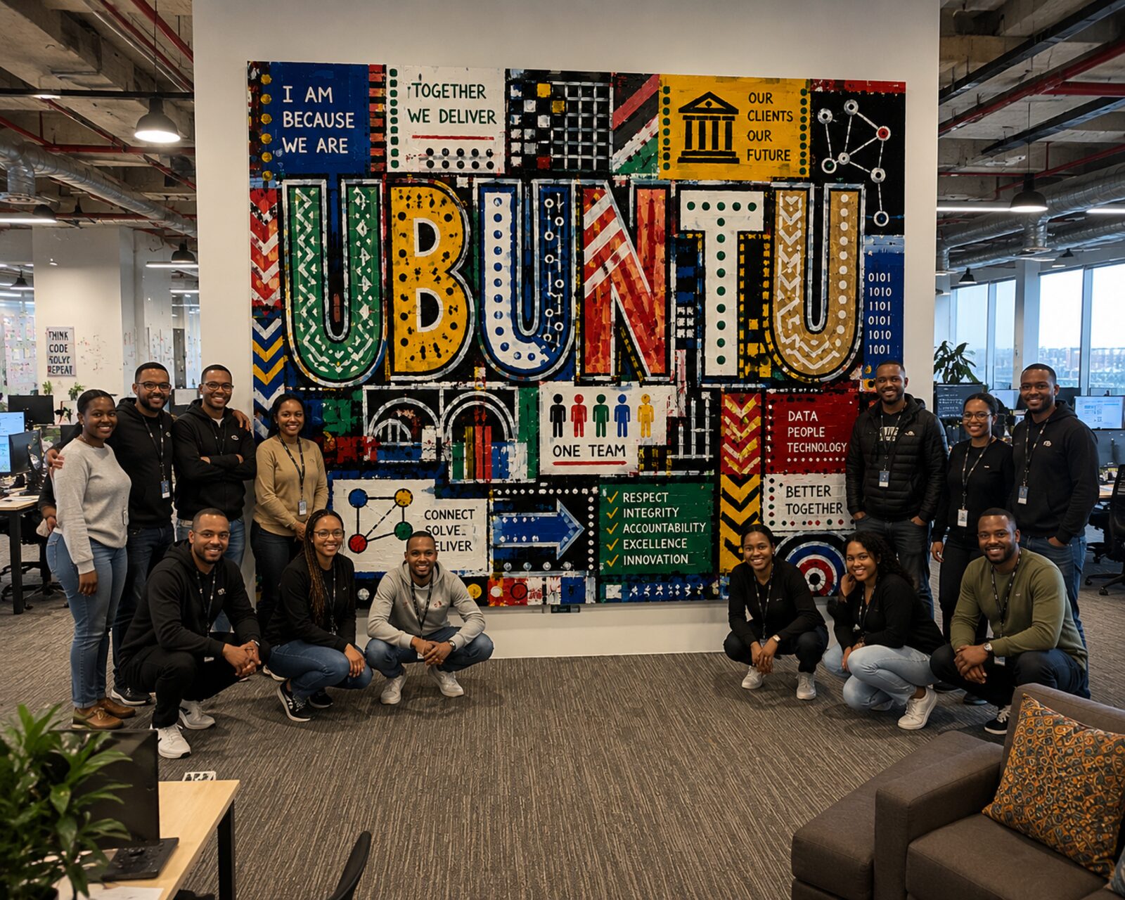
UBUNTU and SYNERGY, painted by the teams themselves during workshops. They're still on the office walls. More about the workshops.
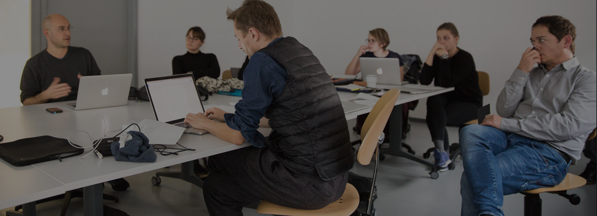
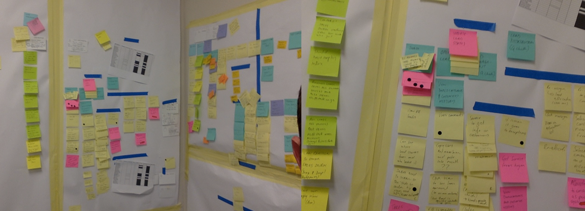
Watch people, get everyone in one room, map the journey before drawing screens, and build it rough on purpose.

From Flash and print in the early 2000s to product design now.
Full-time UX — research, wireframes, prototypes, Salesforce work — while Cowboy runs sprints and workshops alongside it.
Financial systems for the new electric Mini through CyberPro and Isanqa, then a long stretch with Liberty into 2022.
Research, design thinking and content strategy for startups that need to move quickly.
Customer One, Activate, Stash, the Gratitude App and others.
Design and front-end. Home loans systems at FNB, then Momentum's digital work in Angular and SASS.
Three years on Yamaha's digital and print work across Motor, Audio, Marine and Music, plus ten aftermarket brands.
Serengeti Moon, teaching Macromedia, Aspen campaigns for Berocca and Cal-C-Vita, Camelot Spa, Head Count Systems, Agility and Orion Group. Design, Flash, code and print.
Wouter is a talented UX designer with decades of experience, and he works with a momentum I've rarely seen … often delivering polished work the same day. His insights helped transform what was a fairly dry mobile app into something genuinely friendly and personable.
No one should underestimate the value that someone with Wouter's skill brings to a project. He pairs a calm, professional demeanour with real soul, both in the work itself and in the relationships he builds along the way. Ask him what he gets up to in his spare time; you'll see what I mean.
No pitch decks, no long proposals. Just a conversation about where you're stuck.