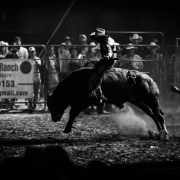

Black and white rodeo-style artwork of an elderly woman riding a wild bull symbolising the emotional cost of poor UX and debt collection systems.

The impact of a small bad experience

So yesterday I experienced an amazing real-world UX case of how bad UX is costing a smallish business a fortune in time, money, labour, and happiness.

I normally rate these rodeos 4/5, but knowing it’s a 60-year-old lady on the bull, she deserves more than five out of five.

So it’s Monday morning.

My phone rings.
Truecaller says: Spam → Caller name: Dr GSV Rudy.

I ignore it.

The phone rings again.
Still spam.
Ignore.

Third time. I answer.

An already annoyed lady asks if she can speak to “M. Gerstein.”

I immediately go defensive.

“I’m W. Kirstein.”

“Do you know him?”

So I say it’s not me and I don’t know him → then I hang up.

But something about the call felt legit — especially because she sounded Afrikaans, and my wife had broken her arm recently — so I phone back.

A very irritated receptionist answers and you know she’s already had a long day before 9AM.

I explain that I’m both “M” and “W” Gerstein, since it’s probably my handwriting.

She immediately confirms.

Turns out she’s calling about one of my wife’s ER bills from when she broke her arm about two months ago. Apparently, the medical aid or gap cover still hadn’t paid.

I tell her I never received anything.

She confirms my email address in a very condescending way. Because clearly, this woman does not make mistakes.

Then it clicks when she says:

“I’ll resend it… It opens with your cellphone number.”

And hangs up.

Now pause there for a second.

Stay paused a bit longer and reflect… because that one tiny UX decision is costing them a fortune — and slowly killing this lady’s happiness.

When I receive the email, I realise I had seen it before.

I just couldn’t open the attachment because I tried my ID number.

The instruction about using my cellphone number was probably buried somewhere in the email… but we’re all on autopilot these days. And honestly, who reads bills to the end… if at all?

And suddenly this entire experience becomes a UX problem.

Think about what failed here:

  • The sender appeared as spam.
  • The naming mismatch created distrust.
  • The mental model for opening the document didn’t match user expectations.
  • The payment process between provider and medical aid already created frustration before human interaction even started.
  • The receptionist inherited the emotional fallout from a system designed by someone who decided 20 years ago to use a cellphone number instead of an ID number.

What’s interesting is that fixing just one UX issue might solve half the chain reaction.

If the document simply opened with the identifier people naturally expect — like an ID number — maybe:

  • the bill gets opened immediately,
  • the claim gets processed faster,
  • fewer follow-up calls happen,
  • fewer people mark the number as spam,
  • and the receptionist doesn’t start every call already irritated.

That’s the thing about UX.

People think it’s about screens.

Most of the time, it’s actually about emotional debt created by systems that don’t align with human behaviour.


UX Helps companyies save 100x on ROI

Getting UX on too late!

Not hiring a designer is one of the most expensive cost-saving decisions a founder can make.

They do look expensive… And jumping into development looks like speed. Lean team. Moving fast. Saving money. And then you ship — and the cracks show.

Wrong assumptions baked into the product. Features nobody asked for. Users dropping off because something just feels off but nobody can explain why.

You built the wrong product for a non-existent client!

The engineer was smart but didn’t know what he was talking about… Because he is not the user!

Then comes the rebuild. The pivot. The wasted sprint that turns into a wasted quarter.

IBM research puts a number on it. Fixing a problem after release costs up to 100 times more than catching it during the design phase. Not 10 times. A hundred.

That’s not a design argument. That’s a financial one.

A good UX and product designer doesn’t just make things look right. They find the wrong assumptions before they harden into code. They put something in front of a real user when changing direction still costs days, not months.

That’s what early design actually buys you — compression. Less time between assumption and truth. Less runway burned on the wrong thing.

And for founders raising or building toward their next round — fidelity matters.

Not just the fidelity of your designs. The fidelity of your thinking. Investors can tell when a product has been validated versus when it’s been wished into existence.

Design is how you show your working.

The teams that bring a designer in early don’t slow down. They stop wasting money on speed in the wrong direction.

That’s the ROI nobody talks about.

#ProductDesign #UXDesign #StartupFounders #DesignThinking #ROI

Design Thinking Studio

Japanese Oil fryer power adapters make better laptop chargers.

Years ago in the early 2000s Apple changed my view on design and introduced me to design thinking. With a borrowed idea.

Japanese kitchen appliances had been using magnetic cords for years. The thinking was simple — if someone trips over the cord, it releases. No pull, no spill, no mess.

Apple had the same problem on their hands. Broken ports, damaged laptops.

Engineering kept reinforcing the hardware. But the hardware wasn’t failing — people were just tripping over cables. That’s not a design flaw… It’s just Tuesday.

So they applied a kitchen fix to a computer. A connector that releases the moment it’s pulled. MagSafe launched in 2006 and people loved it immediately — not because it was clever, but because it just made sense.

That’s the thing about good design. It doesn’t always come from reinventing anything. Sometimes it’s just paying attention to what’s actually happening and being open enough to find the answer somewhere completely unexpected.

A deep fryer solved a laptop problem.

Nobody saw that coming.

Funding for startups

End of runway… Now you fly!

Sitting in the morning, designing and planning my latest app, I realised it again.

As a creator and founder, my biggest fear is running out of time before anyone gives a damn about what I built.

That’s the real fear. Runway ending. Traction missing. A product that works — but for nobody in particular.

And here’s the brutal part. Most founders hit that wall not because they built badly. Because they built blindly.

Nobody told them the user they imagined doesn’t actually exist the way they imagined them.

That’s a design problem. Specifically — a UX problem nobody prioritised early enough.

Good UX and product design isn’t about screens and colours. It’s about compression. Compressing the time between your assumption and the truth. Putting something real in front of a real person before the build hardens into something you can’t change without a rewrite.

It turns months of “we think users want this” into days of “here’s what they actually said.”

That’s not a nice to have. That’s runway protection.

Every founder says they’re customer obsessed. Very few have a process that proves it before launch.

Design is that process.

If you’re burning cash building something users haven’t validated — you don’t have a development problem. You have a discovery problem.

Discovery is cheap. Rebuilding isn’t.

Let’s grab a coffee!

https://wouterkirstein.com/?p=569

Design helping founders and investors do it safer

Mind The Gap

Building the wrong thing.

For the product owner — wasted sprints, missed market, team credibility gone. For the investor — burned runway, no traction, no exit.

Same fear. Different seats. Same bill.

And here’s what most investors don’t realise they’re funding when design is an afterthought — they’re funding assumptions. Unvalidated. Unchallenged. Baked into code before a single real user ever saw the thing.

That’s not a product risk. That’s a portfolio risk.

The best design process does one thing investors should care deeply about — it makes assumptions visible and killable before they become expensive.

A prototype costs days. A pivot costs months. A wrong product costs the round.

When you’re doing due diligence, don’t just look at the roadmap. Look at how they validate. Look at when design enters the process. Look at whether anyone has actually watched a real user try to use this thing.

Because a team that designs before it builds isn’t just more creative.

They’re less likely to burn your money.

Design isn’t the pretty layer on top. It’s the risk management your term sheet forgot to ask about.

Mind that gap.

Test your ideas in 5 days with Pink Cowboy UX Design and product designer

Why your team being stuck is a design problem

There’s a specific kind of stuck that kills startups. Not the dramatic kind where things blow up. The quiet kind where months go by, the team is busy, everyone looks productive, but there’s nothing to show for it.

I walked into exactly that on an insurance project. The team had been at it for months. Smart people, good intentions, real market need. But every conversation circled back to the same debate. How should the ID scan look? What if the user does this instead of that?

The designers were working at full fidelity before anyone had tested a single assumption. Pixel-perfect screens for flows nobody had validated. It looked impressive in Figma. But it was all built on guesswork.

Analysis paralysis is more common than most founders want to admit.


When I came in, I didn’t ask to see the designs. I started with a low fidelity approach – total collaboration, focused only on the most important requirements.

The graphic designers were not happy.

We ran a five-day design sprint. No high fidelity, no perfecting, no rabbit holes. We started with paper and finished in Balsamiq – rough boxes, basic interactions, just enough to put in front of a real user and learn something.

By Friday we had our first test. And we got it completely wrong.

The flow made sense to us but confused every single user who tested it. We didn’t even get to the ID scan. The team had assumed users understood industry terms like “third party” – they didn’t. Users got stuck way before the clever stuff, somewhere nobody had thought to question.

That failure cost us a couple of hours in design time. If we’d built it out properly first, it could have cost months – maybe millions if it had carried on for a year.


Here’s what most founders miss about failure: a fast failure is not a setback, it’s data. The goal of a sprint isn’t to get it right on the first try. It’s to find out what’s wrong before you’ve committed serious time and money to it.

We went back the following week with a new approach based on what we’d learned. The second prototype tested better. The third better still. A month later, they shipped something real.

The entire project changed not because we had better designers or more budget. It changed because we stopped trying to perfect something nobody had tested yet.


If your team has been building for months and you’re not sure what you actually have, that’s a signal worth paying attention to. The problem usually isn’t talent or effort. It’s the sequence. Perfecting before testing, designing before validating, debating before learning.

A design sprint doesn’t solve everything. But it breaks the cycle. It forces a decision, creates something tangible, and puts it in front of real people fast enough to actually change direction before it’s too late.

Speed plus honest feedback beats perfection every time.


Pink Cowboy is Wouter Kirstein’s design studio, focused on helping founders move fast, test smart, and build on solid foundations.

Why Corporate Design Is Too Slow (And What to Do About It)

Most corporate teams don’t have a design problem.

They have a speed problem.

Projects take months.
Decisions take weeks.
By the time something ships… the opportunity has already shifted.

And everyone knows it.


The Real Bottleneck Isn’t Design

It’s not a lack of talent.

It’s not a lack of tools.

It’s the way work moves through the system:

  • Multiple stakeholders
  • Layered approvals
  • Risk management
  • Constant alignment

All of it makes sense.

But together… it slows everything down.


The Cost of Moving Slow

In a corporate environment, delays don’t always feel obvious.

But they show up in real ways:

  • Missed market opportunities
  • Low adoption of new features
  • Internal frustration across teams
  • Solutions that are outdated before they launch

And the biggest one:

👉 Loss of momentum


The Gap Between Strategy and Execution

Corporate teams are strong on strategy.

  • Business cases
  • Roadmaps
  • Planning cycles

But where things break down is here:

👉 Turning ideas into something tangible, quickly

Because without something real to react to…

Everything stays theoretical.


The Case for Short Design Sprints

This is where short, focused design sprints change the game.

Not as a replacement for process.
But as a layer inside it.

A way to:

  • Test ideas quickly
  • Align stakeholders faster
  • Create something tangible early
  • Reduce risk before full investment

What a 5-Day Sprint Looks Like in Corporate

This isn’t chaos.
It’s structured speed.

In 5 days, you can:

  • Align on a clear problem
  • Explore and decide on a direction
  • Prototype a real solution
  • Get early feedback

Instead of weeks of discussion…

You get something people can actually see and respond to.


Why This Works in Complex Environments

Because it does three critical things:

1. Forces Decisions

Constraints remove endless debate.

2. Creates Alignment

People align faster around something tangible.

3. Reduces Risk

You test before committing full resources.


This Is Not “Fast Design” — It’s Smart Design

The goal isn’t to rush.

It’s to focus effort where it matters most.

Instead of spending months refining assumptions…

You validate them early.


Where This Fits Best

Short sprints are especially effective for:

  • New product concepts
  • Feature validation
  • Process improvements
  • Customer experience challenges
  • Internal system optimisation

Anywhere there’s uncertainty…
and a need to move forward.


The Shift Corporate Teams Need

The companies that are winning right now aren’t the ones with the biggest teams.

They’re the ones that:

  • Test faster
  • Learn faster
  • Adapt faster

And that starts with how quickly they can turn ideas into something real.


Let’s Help You Move Faster

If your team is stuck between ideas, approvals, and slow delivery cycles…

A short design sprint can unlock momentum.

In 5 days, we help you:

  • Turn strategy into something tangible
  • Align teams quickly
  • Move forward with confidence

No disruption to your systems.
Just a smarter way to move within them.

Let’s build something real. Fast.

Black and white rodeo-style artwork of an elderly woman riding a wild bull symbolising the emotional cost of poor UX and debt collection systems.

Why Most Cannabis & Supplement Brands Look the Same (And How to Stand Out Fast)

Take a walk through any supplement store.
Or scroll through cannabis brands online.

Everything starts to look… the same.

  • Green packaging
  • Leaf icons
  • Minimalist fonts
  • “Clean” branding that says nothing

And somehow, every brand thinks they’re different.

They’re not.


The Problem Isn’t Design. It’s Fear.

Most founders in these industries play it safe.

Because:

  • There are regulations
  • There’s stigma
  • There’s uncertainty

So they default to what feels “acceptable.”

Clean. Neutral. Inoffensive.

But here’s the problem:

👉 Safe doesn’t sell.


You’re Not Competing on Ingredients

Let’s be honest:

Most customers don’t deeply understand:

  • Your formulation
  • Your sourcing
  • Your subtle differences

What they do understand instantly is:

👉 How your brand feels

And in a crowded market, that feeling is what drives the decision.


The Shelf Test

Imagine your product sitting next to 20 others.

Ask yourself:

Would someone notice it in 3 seconds?

If the answer is no…
You’ve already lost.

Because in these markets:

  • Attention is everything
  • First impression is everything
  • Differentiation is everything

Why Most Brands Blend In

Here’s what’s happening:

Everyone is copying:

  • The same colour palettes
  • The same “premium minimal” look
  • The same visual language

So instead of standing out…

They create a category blur.


What Actually Works

The brands that win do one thing differently:

They commit.

They choose a direction and push it hard.

That could be:

  • Bold and aggressive
  • Raw and natural
  • Premium and clinical
  • Playful and disruptive

But it has to be clear.

And it has to be consistent.


Design for Real Life, Not Just Instagram

A lot of brands are designed for screens.

But your product lives in the real world.

  • On a shelf
  • In someone’s hand
  • Next to competitors

That’s where design matters most.

That’s why:

👉 Packaging is not decoration
👉 It’s your sales tool


Speed Matters More in These Markets

Cannabis. Supplements. Wellness.

These markets move fast.

Trends change. Regulations shift. New brands appear weekly.

If you take 3 months to “get it right”…

You’re already behind.


From Idea to Shelf — Fast

This is exactly why we work in 5-day sprints.

Because in one week, you can go from:

  • Idea → real product look
  • Concept → something shelf-ready
  • Thinking → testing

And that’s where the real advantage is.


Most Brands Overthink. The Best Ones Execute.

You don’t win by having the most polished idea.

You win by:

  • Getting to market faster
  • Learning faster
  • Adapting faster

If Your Brand Looks Like Everyone Else…

It’s not your product that’s the problem.

It’s your positioning.

And that can be fixed.

Fast.


Let’s Build Something That Stands Out

If you’re launching a cannabis, supplement, or wellness product…

You don’t need another “clean” brand.

You need something people actually notice.

We’ll help you build a shelf-ready brand in 5 days.

Something bold. Something real. Something that sells.

From Idea to Income: How to Test Your Business in 5 Days

You don’t need another idea

You already have one.

Maybe more than one.

The real problem is this:

👉 You don’t know if it will work.

So you wait.
You think.
You tweak.

You try to get it “right” before you start.

And in the process…

👉 Nothing happens.


The Trap Most People Fall Into

They believe they need:

  • a full website
  • a finished product
  • perfect branding
  • everything in place

Before they can launch.

So they spend weeks… or months… building.

Only to realise:

👉 No one actually wants it.


The Truth About Business Ideas

Ideas don’t fail because they’re bad.

They fail because they were never tested properly.


What You Actually Need

Not a finished product.

Not a full build.

👉 You need proof.

Proof that:

  • people understand it
  • people want it
  • people are willing to act

Without that, everything else is guesswork.


The Shift: Test Before You Build

Instead of asking:

“How do I build this?”

Ask:

“How do I test this?”

That one shift saves you:

  • time
  • money
  • energy

What a 5-Day Test Looks Like

You don’t build the full thing.

You build just enough to answer one question:

👉 Would someone actually want this?


Day 1 — Define the Idea

What are you offering?
Who is it for?
Why should they care?

No fluff. Just clarity.


Day 2 — Shape the Message

How do you explain it simply?

If people don’t understand it immediately,
they won’t act.


Day 3 — Create the Experience

A simple landing page.
A flow.
A prototype.

Something people can interact with.


Day 4 — Put It in Front of People

This is where most people hesitate.

You don’t need thousands of users.

👉 You need real reactions.


Day 5 — Learn and Decide

Now you know:

  • what works
  • what doesn’t
  • what needs to change

Or…

👉 whether to walk away


Why This Works

Because it removes:

  • assumptions
  • overthinking
  • unnecessary build

And replaces it with:

👉 real feedback


The Biggest Mistake

People fall in love with their idea.

Instead of testing it,
they protect it.

And that’s what kills it.


The Real Advantage

When you move this way:

  • you learn faster
  • you adapt faster
  • you waste less

And over time…

👉 you win more


The Hard Truth

The market doesn’t care about your idea.

It cares about:
👉 whether it solves a real problem


Call to Action

If you’ve been sitting on an idea…

If you’re unsure whether it will work…

Stop building.

Start testing.


Optional LinkedIn Caption

Most people don’t fail because their ideas are bad.

They fail because they never test them properly.

They build too much.
Too slowly.
With no real proof.

You don’t need a full product.

You need clarity.

Here’s how to test your idea in 5 days 👇

[link]

The Hidden Cost of Slow Design (And Why It’s Killing Your Business)

You don’t notice it at first.

The delays feel normal.

A few meetings.
Some feedback rounds.
A bit more “alignment.”

Another week goes by.

Then another.

And before you realise it, months have passed —
and nothing meaningful has changed.


The Lie We’ve Been Sold

That good design takes time.

That you need:

  • long strategy phases
  • endless revisions
  • multiple approvals

It sounds responsible.

It sounds thorough.

But in reality, it’s often just:

slow decision-making disguised as process


What Slow Design Is Actually Costing You

Most businesses think the cost is:

“We’re paying the agency for more time”

That’s not the real cost.

The real cost is what’s not happening.


Lost Revenue

Every day your website isn’t converting, you’re losing money.

Not hypothetically.
Literally.

People are visiting.
They’re just not taking action.


Lost Momentum

Energy matters in business.

When things drag:

  • decisions get softer
  • teams lose focus
  • ideas lose sharpness

What started as a strong push becomes background noise.


Lost Opportunities

While you’re still “working on it”:

  • competitors are launching
  • markets are shifting
  • customers are choosing someone else

Speed isn’t just an advantage.

It’s survival.


Why Design Becomes Slow

It’s not because people are lazy.

It’s because of how most projects are structured.


Too Many Voices

Everyone wants input:

  • stakeholders
  • managers
  • teams

So decisions get diluted.


No Clear Outcome

If no one agrees on what success looks like,
everything becomes negotiable.

And negotiation takes time.


Fear of Getting It Wrong

So instead of deciding, teams:

  • explore more
  • tweak more
  • delay more

Trying to avoid risk…

while creating a bigger one.


The Shift: Speed Is Not Reckless

There’s a misconception that fast = careless.

But real speed is not chaos.

It’s:

  • focused thinking
  • clear decisions
  • removing everything unnecessary

Speed forces clarity.


What Happens When You Move Fast

When you compress time, something interesting happens:

  • conversations become sharper
  • priorities become obvious
  • decisions get made

Because there’s no space to hide.


The 5-Day Approach

Instead of stretching work over months,
you compress it into one focused sprint.

Not to rush —
but to remove everything that slows you down.


You’re not skipping steps.

You’re removing:

  • unnecessary meetings
  • unclear thinking
  • wasted effort

The Real Advantage

Speed doesn’t just save time.

It creates:

  • momentum
  • confidence
  • direction

And those are the things that actually grow a business.


The Hard Truth

Most businesses aren’t stuck because they lack ideas.

They’re stuck because they take too long to act on them.


Call to Action

If things have been dragging…

If decisions feel slow…

If your business hasn’t moved in months…

It’s time to change the pace.

You don’t need more time.

You need a better way to use it.


Optional LinkedIn Caption

Slow design feels safe.

More meetings.
More feedback.
More time.

But while you’re “working on it” —
you’re losing momentum, money, and opportunities.

Speed isn’t reckless.

It’s the difference between moving and standing still.

Here’s the real cost of slow design 👇

[link]